If you’re just starting out trying to dress in tailored clothes, you’ve probably read or been told to buy light gray trousers as the first pair that you buy. They’re the most versatile, pairing well with nearly every jacket you are likely to buy. It’s good advice, and to explain why, it’s helpful to understand two aspects of color theory: the color wheel, and its related concept of the HSB or HSV color space.
Most are familiar with the color wheel, which Sir Isaac Newton rendered in the 17th century. It maps three primary colors onto a circle, with secondary and tertiary colors, or often the complete color spectrum, completing the circle (most have seen this in grade school; sometimes it’s red, green and blue; other times it’s red, green and yellow; there are reasons for that, but I don’t need to get into that here). The HSV and HSB (hue, saturation, and value or brightness) color spaces were invented in the 20th century to depict how the human eye perceives color in an intuitive way. These take the color wheel, and add a third dimension for brightness (that is, how bright or dark the color is), creating a cylinder. So around the top of the cylinder, each hue increases in saturation from the inside out, and the brightness decreases as you move from the top to the bottom of the cylinder until it becomes black. Thus a color is described by its hue, saturation and brightness.
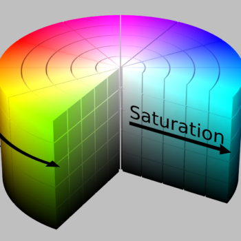
At the basic grade school level, you can understand the concepts of complementary, triadic, tetradic, and analogous color combinations using just the basic color wheel. That in itself is valuable for understanding why tan chinos look good with a blue blazer (blue and yellow are complementary). But adding saturation and brightness to your understanding explains it even more: a blue blazer is usually a saturated blue but with a low brightness value, and tan chinos are usually less saturated and have a high brightness value; so not only is the color combination visually pleasing by being complementary, there is contrast as defined by the other two aspects of the HSB color model.
Now we can understand why those light gray trousers are so versatile and useful for guys just starting out to build a classic tailored-centric wardrobe. Gray has no color value or saturation; it is literally only a brightness value somewhere between white and black. So the only characteristic you have to think about is contrast between light and dark. There’s a good chance most jackets you start out buying in the beginning will be darker in brightness value. Thus, it removes a whole layer of decision making about whether your jacket works with your trousers (not to mention not having to worry about whether there are any clashes in the pattern—another dimension I won’t get into in this post).
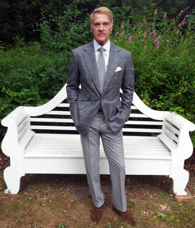
Darker grays are a little less versatile than lighter, because if your trousers are of a similar brightness value to your jacket, it can look muddy. Or worse, if your jacket is a shade of gray that’s very close but it’s clearly a different fabric, it can look like you accidentally mismatched your suit jacket and trousers. Still, grays in the various shades you can buy are some of the safest bases for a good outfit.
Growing beyond gray
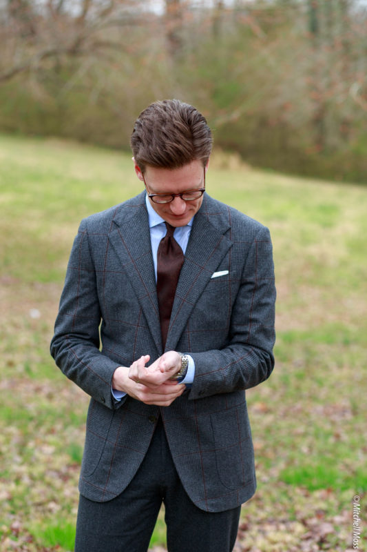
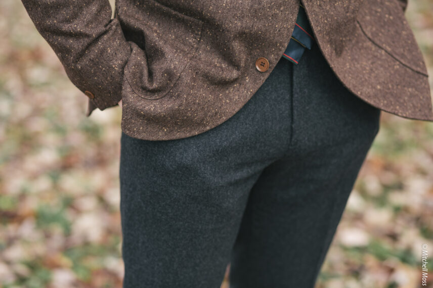
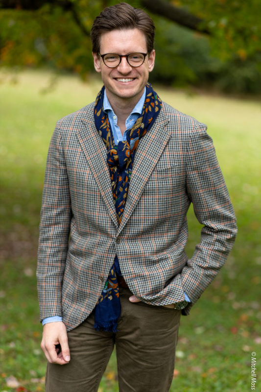
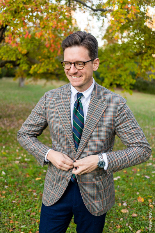
Eventually you’ll probably start to grow tired of only wearing gray trousers. When you’re ready to do so, using the HSB color model as a paradigm to assess colors is helpful. To be sure, learning and intuiting what hues work together is the toughest to master. So to start off, I’d suggest experimenting more with the tried-and-true color combos of the classic menswear world, while mixing it up with the saturation levels and brightness values. Examples of those would be navy with tan, brown with light blue, maroon with hunter green, olive with maroons or navy. An example from my wardrobe would be how I wear my gun club jacket. While being made of like 8 different colors of yarn, it resolves to a sort of dusty tan in a mid to light brightness value; I combine it with a darker and more saturated olive pair of five pocket pants to great effect.
Learning to see undertones
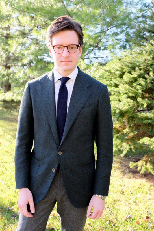
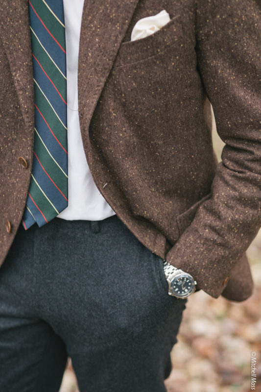
As you try more combinations, you will notice that there are underlying hues in the colors of your clothes. For instance, my winter-weight navy blazer isn’t what you would normally picture when thinking of a true dark navy; it’s not only slightly lighter, but it’s got a definite turquoise undertone. Which is beautiful and amazing, but it means the jacket looks bad when worn with trousers with clashing undertones (it doesn’t look good with olive, for instance). Darker shades can be more forgiving than lighter shades, as the hues don’t jump out at the eye as much because the fabric is literally reflecting less light.

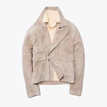
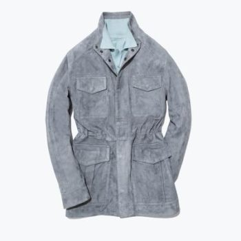
Noticing and understanding these undertones is the key to mastering all three facets of the HSB color model. It’s how you can create a low-contrast look that makers like Stoffa make seem so easy (particularly in those lighter shades). They make beautiful outfits using clothes in sandy tans combined with dusty pinks and browns, creating a visually relaxing palette that looks like it came right out of a vintage painting of a desert landscape. But the risk is high—brown will sometimes have a distinctly orange undertone that you won’t notice until it’s next to a tan with a distinctly pink undertone, and they look awful next to each other. Some people have a trained eye, and can easily identify the undertones and instinctually know what will pair well. For the rest of us, trial and error, as well as carefully studying the color combos that look so good, can help sharpen our own innate sense of color.
Derek Guy at Put This One recently wrote about color undertones, giving some very practical advice and lots of great photo examples here.


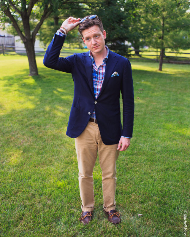


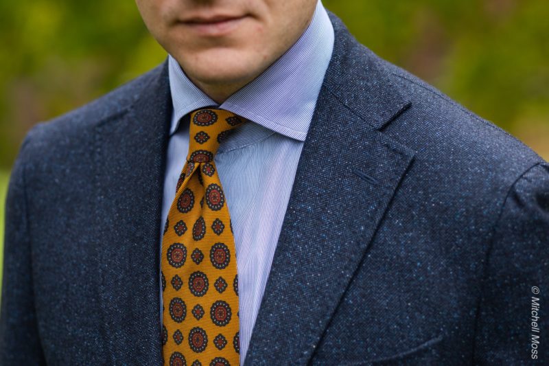
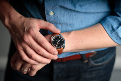
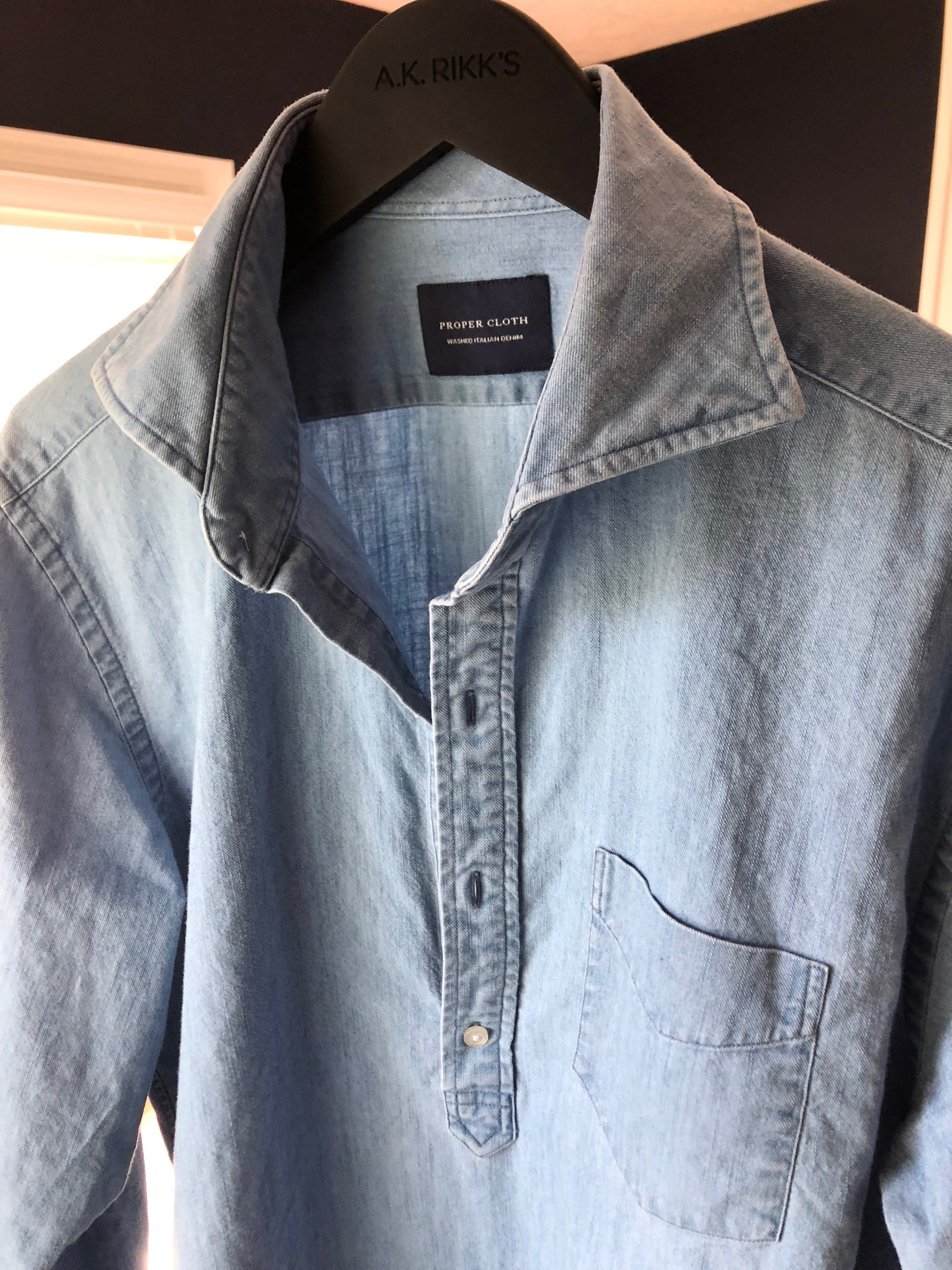
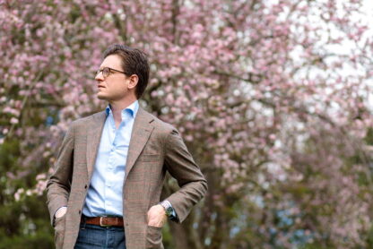
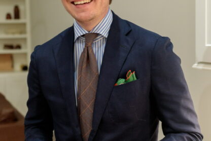

I love the mustard tie in the last photo. Does anyone know where it can purchased?
It’s a Brooks Brothers ancient madder tie from several years ago I got lucky and found on eBay. I’m always looking for an alternative whenever I link it in photos and here’s one I found recently that’s sorta similar-ish:
https://shibumi-firenze.com/ties/printed/3246/ancient-madder-silk-tie-terracotta-i-hand-rolled
Here’s another one that isn’t super similar in pattern but is in the same vein: https://hansensclothing.com/best-of-class-red-and-gold-medallion-italian-madder-matte-finish-woven-silk-tie-by-robert-talbott/?sku=53910-01-REG
This seems like it might be close too: https://www.paulstuart.com/mens/accessories/ties-and-pocket-squares/neck-ties/1507200-N710.html?dwvar_1507200-N710_color=N710&dwvar_1507200-N710_size=ONE-SIZE&quantity=1
Ooh nice find. Thanks!
I received the Paul Stuart tie as a gift. The color is almost a perfect match.